
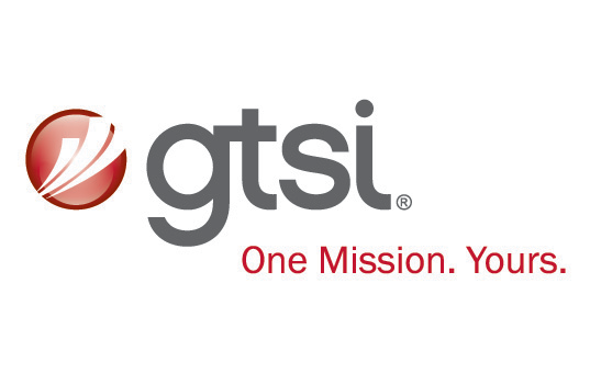
Left: Previous logo and tagline | Right: New logo and tagline

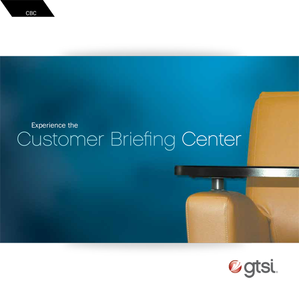
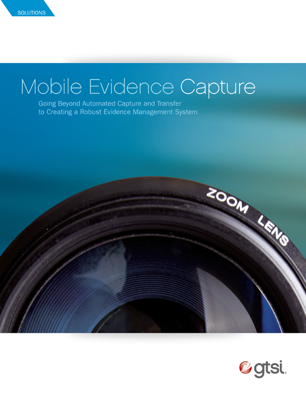
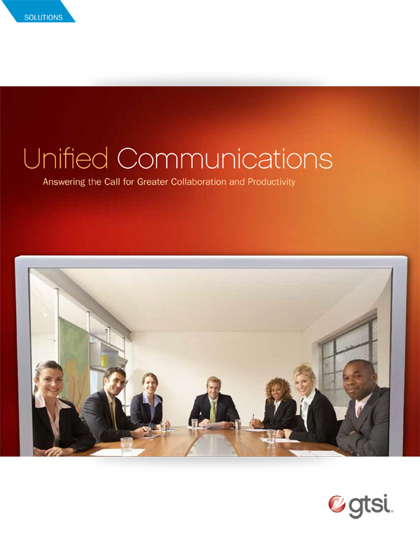
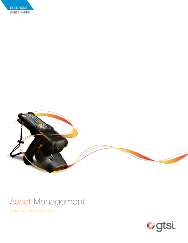
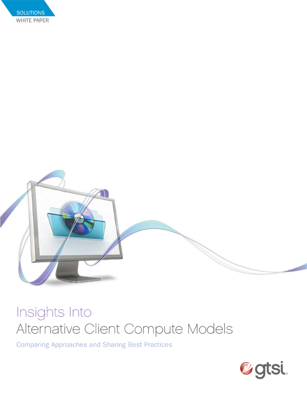
Previous brochures were dated and did not give insight to the subject matter. New brochures provided a color scheme and a glimpse to what the brochure was about, enough to create intrigue.


Challenge: GTSI had been a profitable reseller of hardware and software to the government, however it was met with thin profit margins and limited capabilities. The online retail space was no longer a business model that they wanted to pursue due to the rise of "Amazon-like" retailers and enterprise accounts from developers. GTSI was to retool their business as a solutions consultant to the government that had capabilities to self-perform and supply their projects.
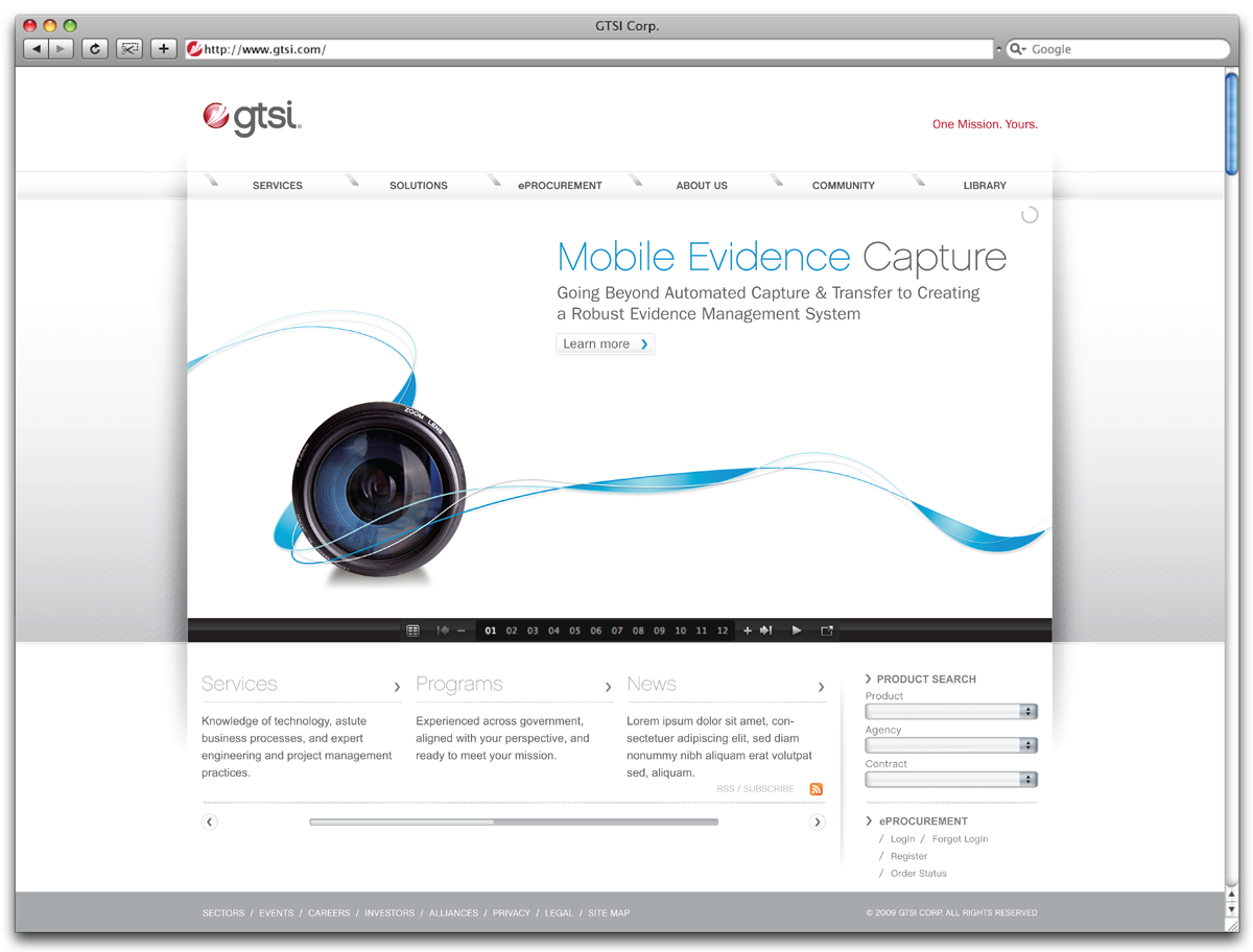
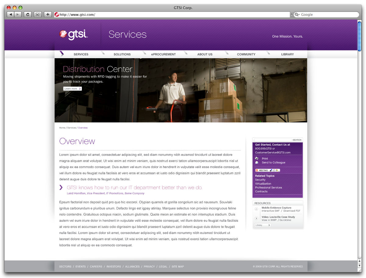
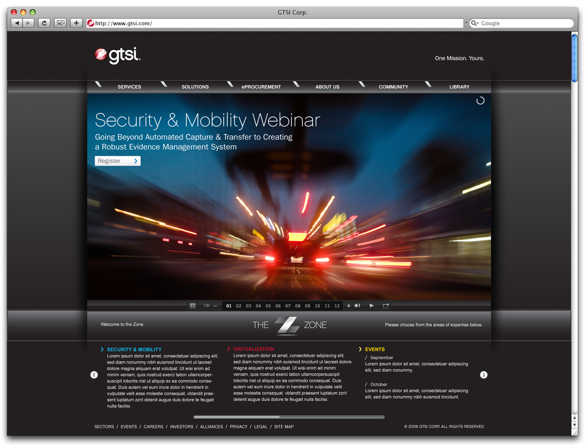
Solution: Though a name change was discussed, there was enough equity in the name not to brand it with a new name. A considerable rebrand signaling the new business venture would be suffice. The logo was redesigned to tie the old with the new. The text mark fashioned how the old logo tied in the 'G' and the 'T'. While the icon had the red color from the swoosh and the used the swoosh, broken into 3 sections representing the 3 core value pillars. By redesigning the collateral and the website, we featured more field technology with a faster pace. The ribbon signified who GTSI intertwined themselves within the solutions they were providing and the clients needs.
Reviewed: September 10, 2007 by UnderConsideration/Brand New