


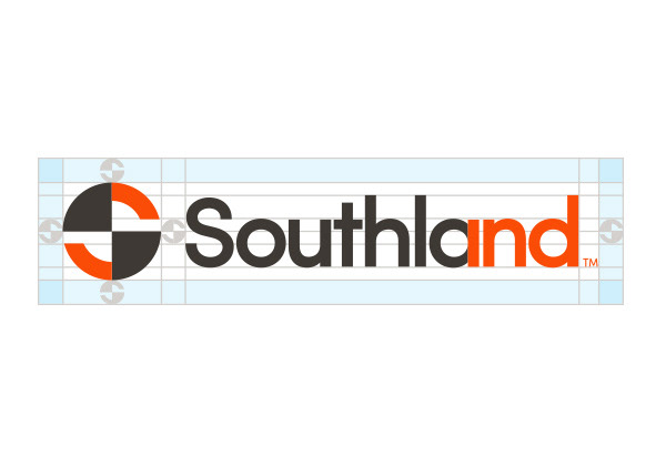
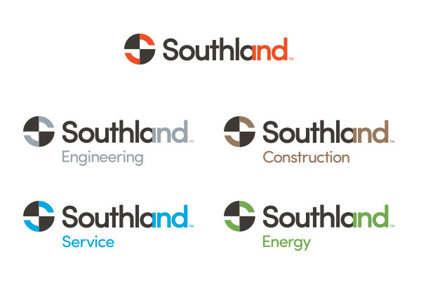

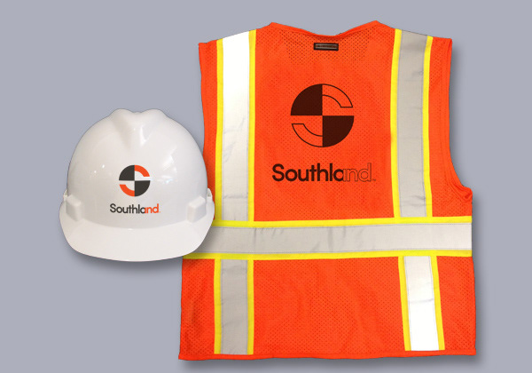
The evolution of Southland’s logo not only signals a new direction for the company, but also allows for separate and unique identities for each of its offerings, including engineering, construction, service, and energy services.
Consisting of two elements, the logo combines the point of connection symbol and the “Southlandind” word mark. The abstraction of the engineering symbol for the point of connection represents the connection that Southland has with its clients and the internal connections that Southland maintains to serve clients better from beginning to end. With the name Southland lending itself to the unique opportunity of blending into the abbreviation of Industries (Ind.), the word mark encompasses Southland Industries as a whole.
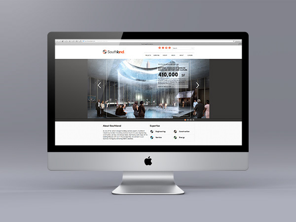
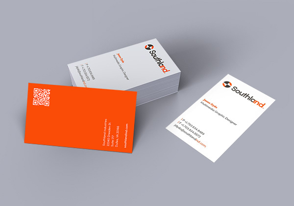
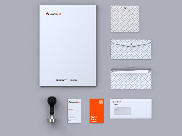
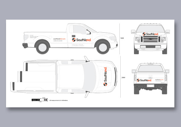
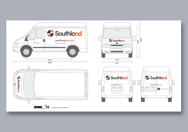
Along with the new logo, Southland has also revealed updated marketing collateral, including a new website. Southland’s printed materials, videos, and website all put a new spin on the traditional title blocks and blueprints produced during a facility’s design and building phases and symbolize the strength that connections build on paper, through human interaction, and through shop fabrication and site installation.
2014 American Graphic Design Award Winner for Logo

Reviewed: July 10, 2013 by UnderConsideration/Brand New